Sunday, 21 September 2014

Colour psychology


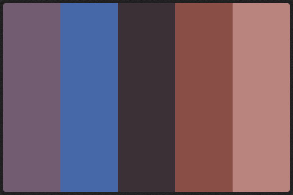
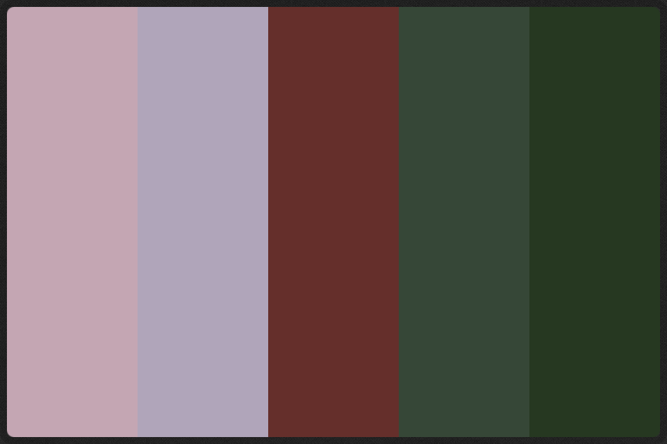
Because I wanted to keep these colour analysees relative to the plants that they came from I have decided that I want to look at them as colour schemes rather than separate colours, this helps in the analysis anyway because colour is always relative to the others around it. I want to ask a few people what emotions they feel these colour schemes evoke and compairs these to the impressions of the plants themselves. I will not tell them anything about the origins of the colours so as not to effect the outcome.
Poppy
 
Comfort
Anger
Violence
Germany
Passive aggression 
Barley
Medieval town
Empty forest
Sadness
Earthy
Bricks
Builders

Vipers buglos
Complex self loathing jealousy 
Tacky dolphin 
Field and freedom
Sea

Plantain
National trust
Poetry
Female
Comfortable
Confusion
Poo

It's amazing the role intensity (saturation) and colour temperature play in the evocativeness of colours. For example, the description of the reds of the poppy as 'anger' is directly related to the heat that the colour suggests. Heat is something with a surpluses of energy and this is picked up in the word violent. It is hardly a surprise that this plant in particular has made its mark as the symbol of war. These colours when combined with the imobile shapes of the plant speak of a stagnent aggression about something that can no longer be changed, ' passive aggression' if you will.

What this really makes me think that combining shape and colour in the right way is incredibly evokative. Perhaps a project that could carry on from this research would be to continue this resesearch into emotions evoked by colour schemes and create an app or programm that allows you to select colours for a design project according to the emotions you want to evoke.


Deconstructed plants

After my plants as animals post, I wanted to look at the separate shapes that the plans were constructed from and why they collectively evoke certain emotions or responses.


One thing that plays a major role in the plantain is the textures, as you can see I have separated them out just as I have the other shapes. This is because they in themselves contain shapes. The almost scale like texture at the top left of the page has a curved point. This curved edge is slightly more friendly than that of a straight point. This is because we interpret the curve as a forgiving shape, sow ethnic soft that won't hurt us.
The gener shape of the plantain head looks a lot like that of a bullet. Although this would obviously be a negative and violent association, the imperfectness of the shape makes this association harder to make and the whole thing a lot softer.
This theme of the 'perfect imperfect' is one that reappeared throughout botany. For example, in the stamen, the way that they cross over one another and are varying different lengths, they still look right and the eye accepts them for what they are. 


Although both the vipers bugloss and the plantain have parts that are pointed and curvey the pointed curve of the bugloss are decidedly unpleasant in comparison. I think this could be because of the way they curve around to the side like a crash claw, as if they have an intent to hurt. This could simply be because of the introduction of a direction which suggests something is deciding that it will point in that direction. This suggestion of sentience in the shape is instantly interpreted as posing more of a threat than something with no sign of sentience. This suggests that we judge and interpret shapes with quite a primaries and instinctive part of the brain. For something to think for its self is instantly dangerous.


As suggested by the animal I chose to represent this plant (a fish) the droplet shape of the seeds have a definite directional component. As previously mentioned this should make the plant seem unsettling and unpleasant and indeed the animal version of the plant was. Could This be down to the way the shapes interlock, creating a repeat pattern that is quite pleasing to the eye. Only after talking to a friend about did I discover why barley seems so friendly; the colour. Nothing that is that beautiful gold colour could ever be unpleasant. This combined with the existing connotations of prosperity that barley has makes it a friendly and happy plant.


There are very few shapes in this plant and funnily enough the most dominant one is really no more than a directionless blob. The way the petals are shaped brings to mind a spreading pool of viscous substance on a flat surface. However, this doesn't seem to make it unfriendly or unpleasant in any way. This could be down to the theory that is slowly revealing its self as my research continues; that a shapes directional intent and level of suggested movement relates directly to how unsettled we are by it. This shape is just an object, no suggestion of sentience can be inferred, therefore it is unthreatening and friendly.

In my next stage of research I want to look into what role colour plays in our interpretation of shapes and how this could relate to branding and design and how I could draw these plants to evoke certain emotions or ideas. 


Saturday, 20 September 2014

Plants as Animals

As mantioned in my previous post I wanted to take a few of the plants I had collected and identified and have a try sat drawing them as animals. I chose barley, vipers bugloss, long headed poppy and rivalry plantain. This was because they both provided a cross section of the total plants I looked at and because I can see ways that they could be turned into animals.


With the barley I felt what really needed to translate over to my barley animal was the sleekness constructed by the way the seeds directionally interlock to create a smooth flourish. Because of this directional component I felt that barley would be a sea creature of some kind, like a darting silver fish that would move in schools. There is a definite collectiveness in the sense that you very rarely get just one barley plant. They move and grow together, a field of barley undulating in the wind in the same way that a school of fish would in the currents of the sea.

Once I started sketching, what in Stanton occured to me was the similarities in structure between the barley and the basic shape of a fishes skeletal system. So, I created a barley fish, it's swimming muscles shaped like the seeds of the barley. The long spines that in the plant extend from these seeds form a type of tail. Perhaps compared to the plant, it doesn't have the inherent pleasantness of the golden colouring. However, I think this would be translated when you had a school of them, alive and moving. It is strange that when an animal it is no where near as friendly as the plant. I think this could be because the plant has so many ingrained connotations of prosperity and well-being that is lost in the translation.

The vipers bugloss is a really unpleasant plant; it's hairy, spikes and stout, as if it were clinging to the ground in a protective and threatening crouch. It is in fact called vipers bugloss because the flower head looks like that of a gaping snake. This threat is what I wanted to bring across to the animal, that is why I went for an insectile base.

I took all the leaves on the stem and pointed them in the same direction to create a greater sense of stoutness and hairiness. The flower needed very little work to make it threatening and the stamen already look like darting tongues. I think his one really captures the plant and the way it made me feel when I first saw it.

I have always had positive feelings towards the plantain. It has a simple elegance of shape that really appeals to me. This simplicity translated across to the animal well because I chose to create a plankton like creature, minuscule in size, designed to float around in the sea, just surviving. The cercular fringe of stamen around the head has always reminded me of a tutu, so it seemed natural that this would become the animals  means of transportation and even a way of filter feeding. I extended this fringe in a spiral fashion around the length of the body.

This lack of sentience that translates as a positive thing has got me thinking about why some of theses plants are pleasant and others no so. It seems that if the shapes of the plant suggest animation in anyway beyond what we would expect of a plant, this becomes unsettling because they could pose a possible great. In this sense it seems that my reactions to these plants is informed by an almost instinctive assessment of their threat level.


Much like the barley, a major part of the impression the long headed poppy makes, is it's movement. When blown in the wind the flower sways and dances and the petals flutter. It is unsurprising therefore that I have gone for another sea based animal.

The poppy not only has it's structure and looks to create an impression but also a century worth of historical connotations. Because of these negative associations with the battle of the Somme I have made it a beautiful but dangerousness animal, the jelly fish. The petals form the soft body which is also covered by the floating stamen from the crown of the dome. The poppy heads act as the tenticals as the most identifiable part of the plant.

This exercise has given me a good direction to go in. I now want to break down these plants into their component parts and analyse why they evoke such different emotions. This will be helpful at the mos basic level of design as well as helping me to look at the way that we look at plants and how. They play their part in branding and identities. 


Thursday, 18 September 2014

Plans for further layers of Research

Although I have done a lot of research I feel that it perhaps doesn't have enough depth yet. So, with the material that I have collected I am going to experiment in some of the areas that I identified in my personal notes under each plant.

One thing that always came up was the way the structure of the plant informed the way the plants felt and the impression they left. So, I want to break down the shapes of the plants and why I interpreted them the way I did. I want to start by drawing a select few, that had a distinct effect, as animals. This is because I was always anthropomorphising the plants when I talked about them, just as many people do with animals. Such as the way that many people find mammals warm and friendly in a social sense, yet find reptiles cold and unpleasant. 

I then want to split up the shapes of these plants and ask other and myself why they have this effect?

Saturday, 13 September 2014

Final Stretch From Burnham Overy to Wells-Next-The-Sea

The real difference of this stretch is that it goes over the sand dunes at wells-next-the-sea. This provides a strong contrast to the salt marshes and slightly inland plants I found on the previous stretches.


Although I am really glad to have the mix of locations that these dunes provide co paired to the rest of the locations. However, there were very few plants here both because it is so dry and close to the sea, so salt tolerance is required.


What is really complex about this location in the context of this stretch, is the fact that it shows the gradual change of the sand dunes into habitable land. In a way the job of the marram grass can really be seen in action.


This is the next stage in the sand dune's life. The soil is now secure enough to support large organism like trees. However, the lack of soil density and it's ability to absorb and hold on to water means that only plants that can deal with dry conditions can really survive here.


This location was also the next stage from the previous ones, in the sense that it had human intervention in the form of paving stones. This means that the plants that have grown here have managed to push through this. Some of them look surprisingly delicate for such strong plants.